

This article was written when we built the LP last year. Since AI is advancing so quickly, the content has become outdated by the time it's being published now... I'm amazed at how fast AI is progressing. Considering that it will accelerate even further in 2026, designers will need to keep up with how they work and how they stay informed, or they'll be left behind... Truly remarkable. With today's Figma Make and Gemini 3, even more is possible. I hope you'll read this as a designer's diary about stumbling along while trying to make the most of AI as it evolves. Also, I've marked the additions with supplementary notes (call them snarky comments) like this, so please enjoy them as a commentary track.
Hello!
I'm Hasshi, a UI designer at Liberogic Inc.
In my previous article, I excitedly reported that I had created a landing page draft in three hours using Figma Make and Gemini.
Here is the deliverable from last time.
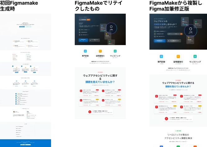
Please check out the previous article here.
Building to Put to Use with Figma Make, Part 1: Creating a Landing Page Draft in 3 Hours with Figma Make and Gemini, a New-Generation Web Production Workflow That Makes Red-Pen Revisions Fast for Busy Executives
https://www.liberogic.jp/topics/20250723-figmamake/
This article is the second half.
After reporting to the president, I was feeling pretty good.

With this, I can handle the president's unreasonable requests at lightning speed!

If the quality is this good in just 3 hours, there's no complaint, right!
...There was a time when I thought that way too. :D
This time, it's about what happened after I eagerly submitted it to the president.
Here's the "Hell of Revisions" edition ⭐️・:*+.\(( °ω° ))/.:+✨
To cut a long story short,
That beautiful layout I made with Figma Make vanished without a trace after the president's comments.
I believe this will still happen even now that AI has evolved.
Lesson learned: Figma Make is unbeatable for "dashboards and wireframes," but maybe it's not quite ready for "LPs full of emotion"...
AI is evolving so fast that it can now be used in many more ways. Wow, I'm amazed!
The CEO's Presentation: The Wall of "Just Make It Look Nice"
The landing page concept I made last time, a reasonably polished SaaS-style design. I showed it to the CEO with complete confidence.

Hey CEO! I put together a rough draft of that landing page at lightning speed using AI! Here's the structure. What do you think?"

Oh, that was fast. (Looking at the screen) ...Hmm, but it feels a bit stiff somehow.

Stiff? (No, for a B2B service that needs to build trust, this level of order is probably better...)

Could you make it more... exciting? Something with real impact, bold and sleek. And add some motion here, with lots of flashy "looks good" decoration.
And there it is. The ultimate move: "Just make it look nice."
Ranked number one on the list of instructions that every designer fears most and that AI understands least.
I often hear things like "make it look nice" or "make it feel more bold." Reading the meaning behind those words is important. These days, designers need communication skills too. As someone who is socially awkward and clueless about reading the room, I find much of this difficult, and every day is a training session... (If designers need communication skills, I should have trained since childhood... Oh well.)
For client work, we dig deeper into the client's underlying thinking and what they truly want at this stage, but since the president is busy, there is rarely time for a proper hearing.
Because of the boss-employee relationship, things can get loose and vague, sometimes resulting in a request made up of vague words.
And so we enter the phase where the whole team chews over the busy president's remarks and rebuilds them.
That was just an excuse. It was nothing more than my own excuse. Seriously.
Inner voice (What do you mean by "nice vibe"?! Even Dr. Gemini can't read that much into it! Could you please stop giving revision instructions with only onomatopoeia, like "dorn" and "shuu"?!)
My feelings haven't changed to this day.
Figma Make VS The President's Brutal Comments
That's when the real battle began.
To bring the "nice vibe" in the president's head to life, we started making revisions on top of the base built in Figma Make, but...
This is where the compatibility of our tools bared its fangs.
What FigmaMake generates is, at its core, a "logically sound web layout". A neatly boxed structure, rigidly built with Auto Layout.
This is where AI's evolution really shows. Generating with the same prompt now produces much better results. It really makes you feel how far AI has come (I've attached a reference image below).
It's beautiful and educational, and it's easy to use as a template theme.
However, the CEO's requests were:

"Scatter some texture across the background, will you!!" "Let the elements break out of their frames." "How about adding some diagonal slits?"
Requests like these, emotional decoration that ignores logic, just keep coming.
Every time I forcibly squeeze decorative images into FigmaMake's generated data, Auto Layout starts screaming, and the entire layout gradually falls apart.

Inner voice (Ahh! The moment I added that background image, even the sections below shifted! FigmaMake, it's not your fault, you're right. It's just that I still can't fully meet the CEO's demands...!)
The hollow feeling of ultimately rebuilding everything by hand
"Tighten up this spacing!" "Make the buttons wobble more!"
To keep up with the brutal stream of markup comments (red-pen corrections) coming in one after another, I reluctantly removed the Auto Layout that Figma Make had generated, broke apart the generated components, and repositioned everything by hand.
A few hours later, what remained on the screen was a completely different design file with not a trace of FigmaMake left in it.
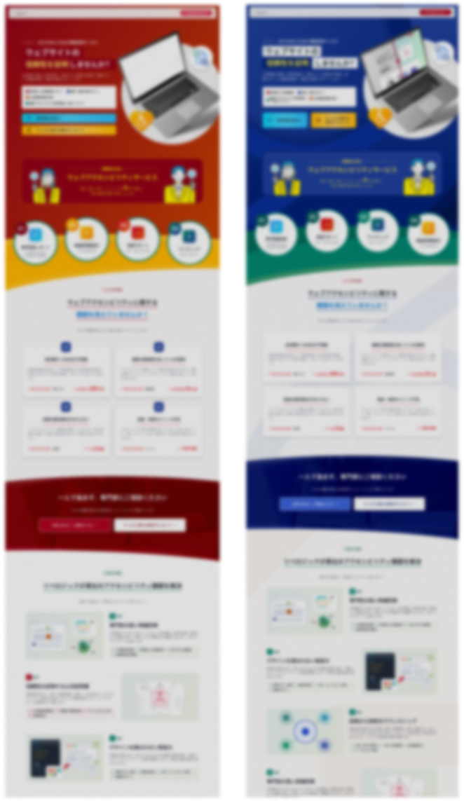
And here is the first draft after I made a number of changes to it. It ended up as a design that was completely different from the initial draft.
On top of that, while all the existing elements had Auto Layout applied, copying from FigmaMake to Figma somehow removed Auto Layout in some places, which meant I had to reapply it manually, adding even more work.
Before I knew it, the rework had taken a huge amount of time.

Inner voice (Wait... wasn't it faster to do this by hand in Photoshop or Figma from the start...? What was my lightning-fast three hours even for...?)
When I realized this in the late-night office, I was overwhelmed by a deep sense of emptiness. Then it was a senior colleague who handed me an energy drink.

Senior colleague: "I'm done with work, so I'm heading home!!"
With a dashing exit, my senior colleague left. So they weren't going to help after all...
Conclusion: FigmaMake's Strengths and Weaknesses
Through this painful fix, I came to understand the characteristics of the Figma Make tool.
If you use it in the wrong situations, it can actually increase the time spent on revisions.
✅ What FigmaMake does well (= finishes in a flash)
- Admin panels, dashboard UIs, app screens, and similar
- It excels at clean grid layouts, forms, tables, and the like.
- Because it instantly builds a "logical structure," the output can be of a quality where you might think, "Couldn't we use this as-is for a SaaS admin panel?" (Of course, manual refinement is still essential.)
- Early wireframes and structural drafts
- If the goal is to check whether elements are missing or excessive, it works well even for landing pages (as long as you're before detailed design work begins).
- It's also very handy for requirement refinement, since you can quickly generate a variety of patterns.
- It proved especially valuable when putting client requests into words and quickly turning them into something visual to align on the overall image.
❌ What FigmaMake struggles with (manual work required)
- Detailed visual polish for landing pages (LPs)
- Designs that rely on "flourishes" or decorative touches to make an impression are still a weak point
- What it generates is essentially a well-organized, easy-to-use UI. Decorative elements such as gradients and patterns are possible, but without clear instructions, the result can end up looking like something from around the 2010s.
- Improving the precision of prompts for design work takes time.
- Turning vague direction like "good vibes" into a concrete design
- This still requires the translation skills of a human designer.
- With more experience using prompts, it seems possible to create things more smoothly with more precise instructions (though that's still beyond me).
Summary: Even so, it proved to be a capable starting draft.
In conclusion, using FigmaMake's generated data as-is was difficult for an LP built from the president's vague instructions.
That said, as I wrote in the previous article, it definitely helped in terms of **"getting a rough draft together in about three hours from a blank slate and drawing out the president's requirements."** Before, I used to spend a lot of time on that part, which slowed down the start of the actual work.
Even the request for "something bold and sleek" only came up because there was a rough draft to react to (positive thinking, as they say).
Key takeaways from this time
- Figma Make is a pro at building "structure."
- "Decoration (ashirai)" is where a designer's skill really shows.
- No AI can yet respond to the president's "that feels right."
Next time, undeterred, I want to take another shot at Figma Make with a "redesign of an internal admin tool UI." (An admin screen… surely an admin screen is where it can shine…!)
As for the landing page design revisions… well.
Yes, I'll keep plugging away by hand from here on!
As for the evolution of AI… Here is the design generated with the same prompt used for the first article.
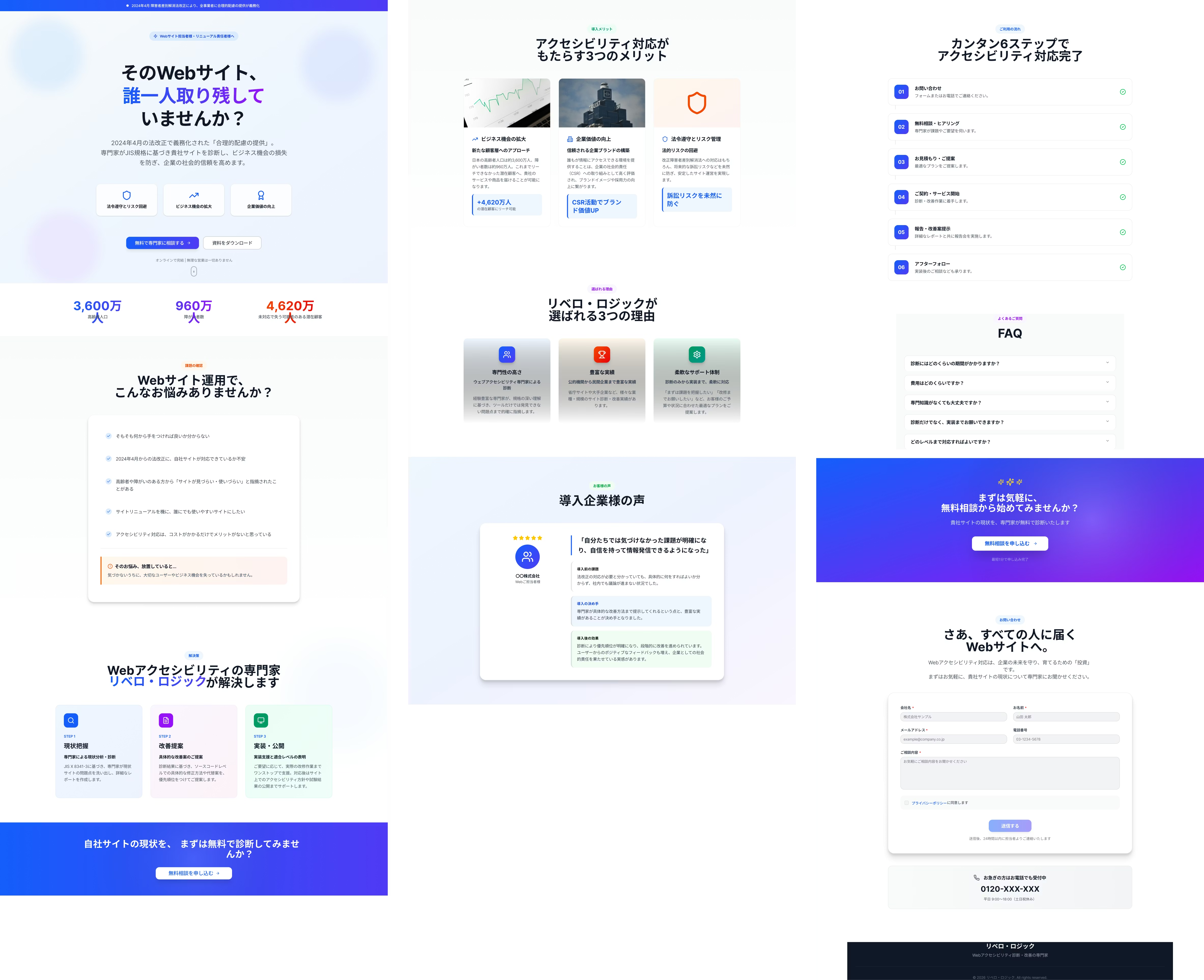
In just a few months, the quality of first-pass generations has skyrocketed. It's honestly quite surprising.
The progress is so rapid that it's a little scary. Today, I find myself wanting to study design every day so I don't fall behind as AI keeps evolving.
And here is the website we just completed.
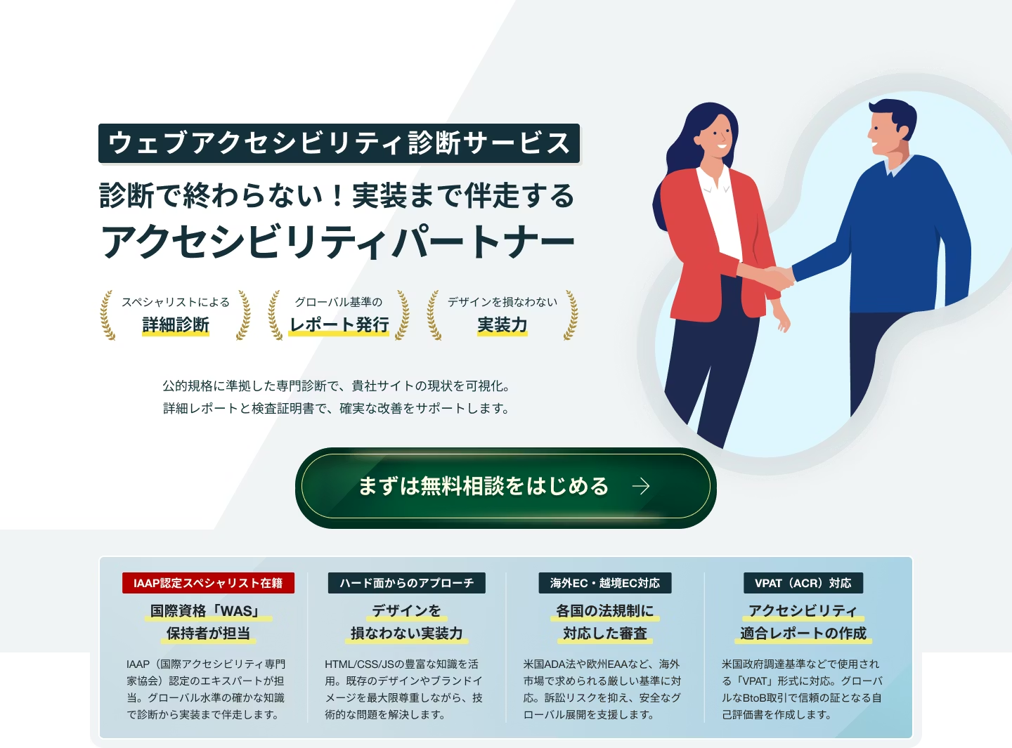
The landing page itself complies with WCAG 2.2 AA, and
it also scores well on Lighthouse (the audit takes a bit of time, but please give it a try! It sometimes hits a perfect score!)
. And on top of that, it's multilingual somehow, without anyone asking!
You can also check out our article on multilingual support
. Browser translation has become mainstream lately, but being able to build a translated site without switching anything, and at a low cost, is really handy!
What do you think?
Don't you think it turned out really nicely 🎵

I've gone on and on here, but I really do feel that having a rough draft to start from cut our working hours significantly!! In the past, we would spend quite a lot of time at the wireframe stage, and then carry things over into design and revise the content again. Those steps have been greatly reduced. Next time I use AI, I plan to put more effort into generating a solid prompt before getting started. And as a reward, a beer.



UI design is evolving every day! I'm also wrestling with how to bring accessibility into landing page design. I've recently stepped away from markup, and lately I've been wondering, "Should I be evolving my JS skills too?" Oh, and I'm a big fan of Takumi Kitamura!
Hasshi
Web Designer / Joined in 2018 / Still a budding designer at heart