

When creating eyecatch images for blog posts, image generation AI tools such as ChatGPT can now produce fairly high-quality visuals.
However, when we tried to put this into practical use, we ran into one problem.
The required image sizes vary too much from platform to platform.
For example, for this tool we assumed the following final outputs.
Purpose | Sizes |
|---|---|
1080×1350 | |
Thumbnail | 1080×1080 |
X | 1200×675 |
Cover | 1280×560 |
Cover Retina | 2560×1120 |
At first, we thought, "Wouldn't it be convenient if we could create one square image and expand it to every size?"
That idea led us to start building Thumbnail Prompt Builder.
What I originally wanted to build
The initial goal was simple.
A tool that takes an article title or summary and generates a prompt you can paste into an image generation AI.
In addition, I wanted to upload the generated square image and have it
- Thumbnail
- X
- Cover
automatically converted to each of the required sizes.
In short, the ideal flow looked like this.
Enter article info
↓
Create image generation prompt
↓
Generate square image
↓
Automatically expand to each media size
At first, the design was fairly straightforward.
"Place the subject in the center and leave some breathing room around it, and it should work for any medium."
That was my thinking.
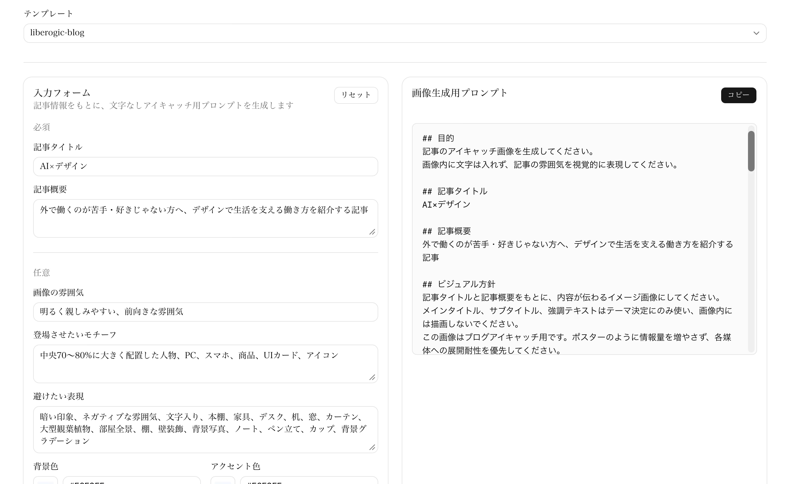
Issues found during hands-on testing
However, when we actually generated the images, problems appeared.
Especially the Cover image.
When a square image is converted to a landscape format,
- the top and bottom get cropped significantly
- the main subject becomes unnaturally small
- the border of the background stands out
- the composition that worked in the square version falls apart in the Cover version
This is what happened.
At first, I tried several approaches while consulting with Codex.
For example:
- Set the SAFE ZONE to the center 60%
- Gather the main subject toward the center
- Prohibit background objects
- Extend the left and right sides using only the background color
- Apply a fade at the edges of the original image
- For X / Cover, scale down slightly to prevent cropping
and so on.
Each of these had a certain degree of effect.
However, one decisive problem remained.
There is a limit to how naturally a Cover image can be created from a square image.
A Cover has a very wide aspect ratio of 1280×560.
If you place a PC, a person, UI cards, icons, and similar elements inside a square image, it may look fine as a square, but the top and bottom will be heavily cropped in a Cover.
Conversely, if you try to fit everything in, the main subject becomes too small.
So we decided to change the design here.
Final conclusion: Split the prompt into two tracks
In the end, we settled on a design that splits the prompt into two.
Instagram / Thumbnail 用プロンプト
X / Cover 用プロンプト
In other words, rather than covering everything with a single square image,
正方形画像
→ Instagram / Thumbnail 用

横長画像
→ X / Cover 用
That's the idea.
This was a fairly significant change in direction.
Initially, I aimed to build a tool that generates everything from a single image, but when I considered real-world use, I realized it made more sense to design a separate composition for each medium from the start.
At worst, a designer could adjust the layout manually, but I wanted something anyone could use without needing Figma or other design tools, so I aimed for a streamlined process driven entirely by AI.
What the current tool can do
With the current Thumbnail Prompt Builder, when you enter article information, it generates two types of prompts.
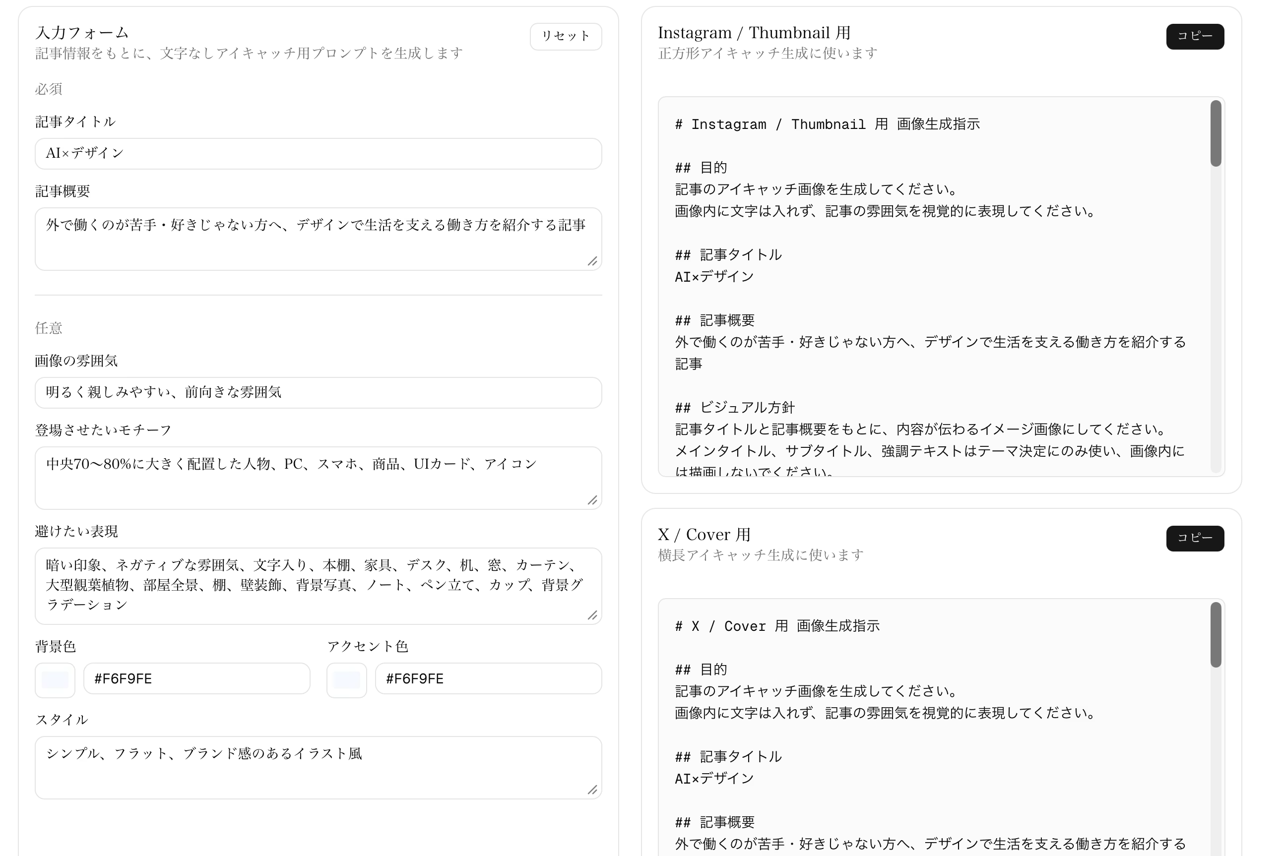
1. For Instagram / Thumbnail
This is a prompt for square thumbnail images.
- 1:1 square image
- Main subject in the center
- Margins that also work well for Instagram vertical layouts
- A composition that is easy to read as a blog thumbnail
with that in mind.
2. For X / Cover
This is a prompt for a wide header image.
- Landscape composition from the start
- Keeps the top and bottom from being cropped easily on Cover
- Leaves margin on the left and right
- Helps it hold up well on both X and Cover
This is the instruction included.
As a result, the cover image is less likely to look like a square image forced into a landscape shape.
Image rendering has also been split into two types.
Image uploads have also been split into two types.
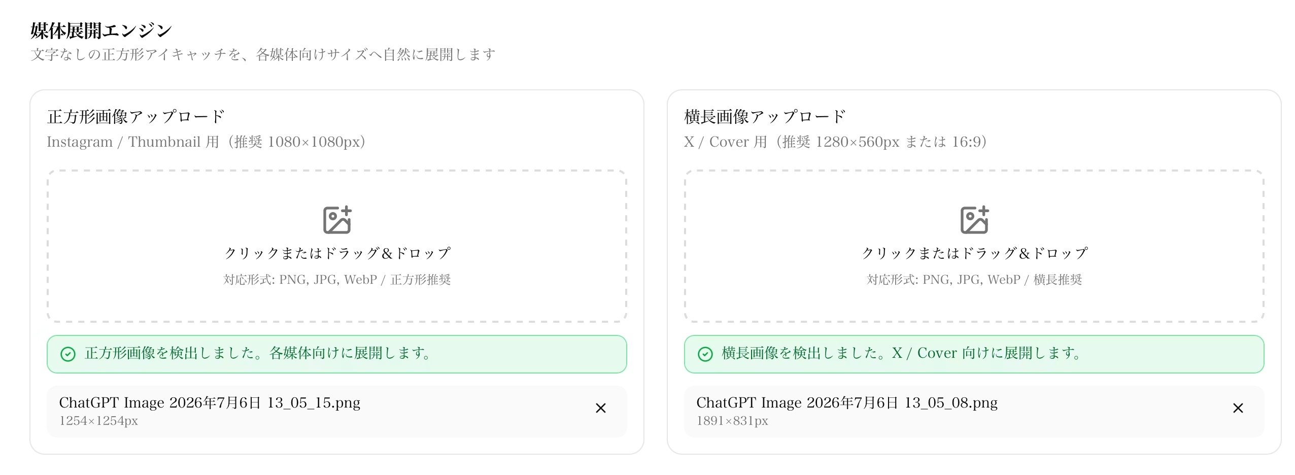
- Square image upload
- Landscape image upload
From square images,
instagram.pngthumbnail.png
will be generated.
From landscape images,
x.pngcover.png[email protected]
will be generated.
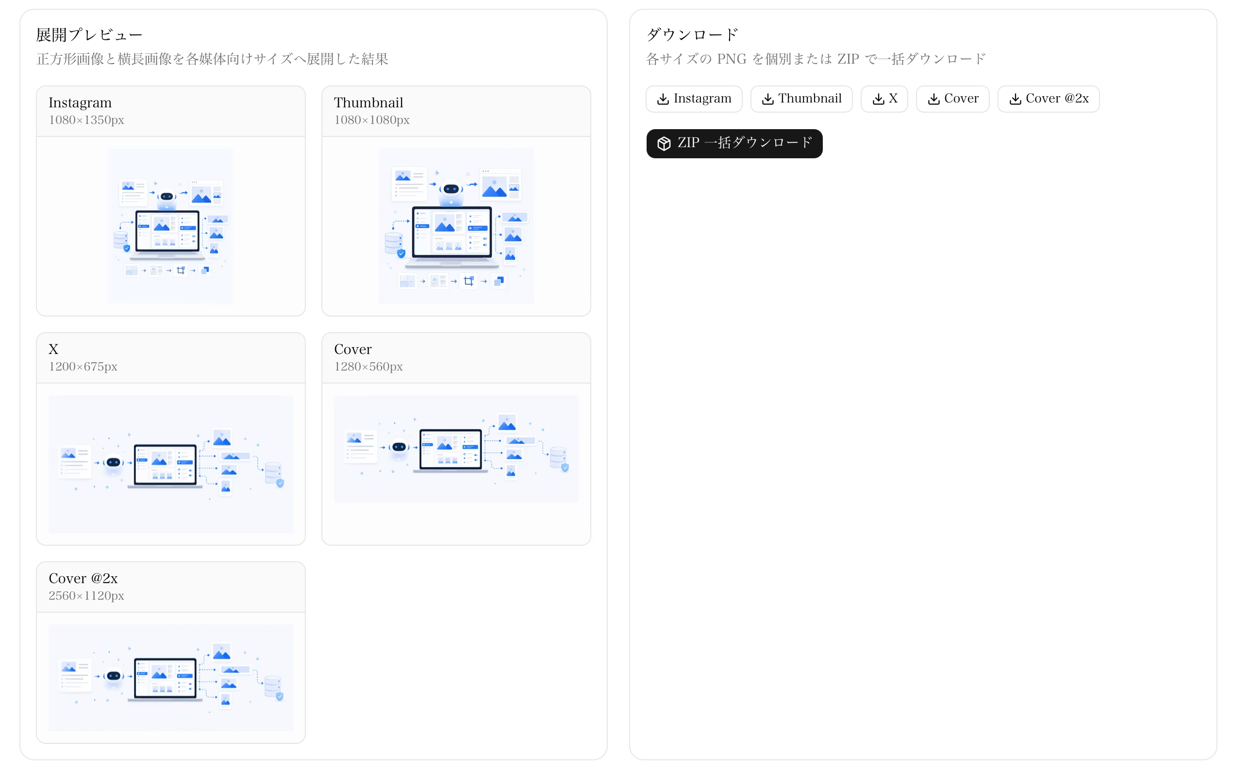
Only the cover is now also output at 2x size for Retina displays.
At first, I tried to output 2x sizes for all images, but Instagram and X tend to compress images when posted, and the thumbnail is already large enough, so I ultimately narrowed it down to outputting 2x only for the cover.
Made sure form input isn't lost
One thing that quietly caused trouble during development was input forms getting cleared when the page was refreshed.
When I had Codex work on it and refreshed the page, whatever I had partially typed would sometimes disappear.
That was a bit frustrating, so I also strengthened the save functionality.
Currently, input is saved in both
- localStorage
- Cookie
.
The cookie side is used as a 7-day backup.
As a result, input is much more likely to be restored even after a page refresh or a reload during development.
What I learned from implementing it
The biggest insight from this development was that
AI image generation is more stable when images are created for each specific use from the start than when they are converted afterward
.
Eyecatch images in particular vary greatly in aspect ratio depending on the platform.
A composition that works well as a square is not necessarily one that works well in Cover format.
If you try to force a shared composition,
- the main subject becomes smaller,
- excess whitespace increases,
- the top and bottom get cropped,
- or the background looks unnatural.
These problems tend to occur.
So in the end,
We didn't over-generalize. We separated the assumptions for generation by use case
we settled on this design.
How we built it through back-and-forth with Codex
This tool did not have a finished form from the start.
Working back and forth with Codex,
- we expanded square images for each medium
- eliminated breakdowns in background extension
- reviewed the SAFE ZONE
- resolved the issue where the main subject shrinks with Cover
- Organize the size definitions
- Add Retina output
- However, Retina is limited to Cover only
- Split the prompt into two tracks
- Save the input content
I gradually changed the design along this path.
My initial idea was to make a square image the universal master.
However, while improving things by looking at test images, I eventually arrived at a more realistic approach: separate the square and landscape versions.
This shift was interesting.
Summary
Thumbnail Prompt Builder is not simply a tool for converting image sizes.
Rather,
It is a helper tool for refining AI-generated eyecatch images into ones that hold up in real-world use.
That is correct.
In its current form,
- it can generate two types of image prompts from article information
- create Instagram and Thumbnail images from square images
- create X and Cover images from landscape images
- output Retina versions for Cover only
- save input content for a set period
.
It became a bit more complex than I originally planned, but I think that made it much easier to use in real-world operation.
If I want to improve it further, I'd like to look into
- prompt template switching
- brand-specific color palette management
- saving generated examples
- output paths for Notion and WordPress
- direct integration with image generation AI
as well. I'd like to try these out.
AI image generation is convenient, but using it in actual articles or on social media still requires human-side design work.
As a tool to reduce some of that design effort, I plan to keep developing Thumbnail Prompt Builder.



UI design is evolving every day! I'm also wrestling with how to bring accessibility into landing page design. I've recently stepped away from markup, and lately I've been wondering, "Should I be evolving my JS skills too?" Oh, and I'm a big fan of Takumi Kitamura!
Hasshi
Web Designer / Joined in 2018 / Still a budding designer at heart